
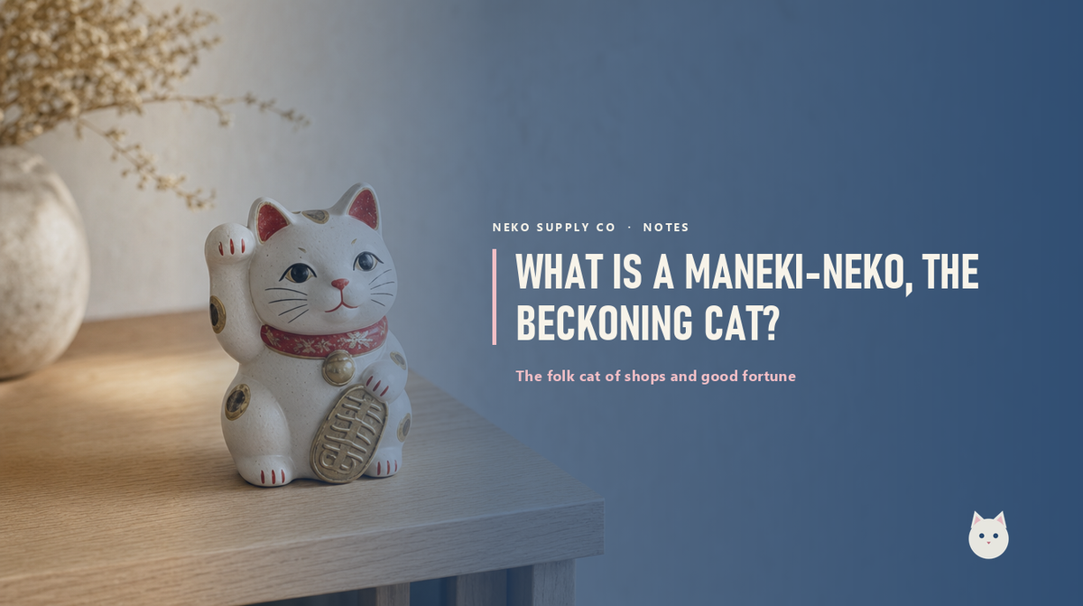
A maneki-neko is the small figure of a cat with one paw raised, usually sitting by the till in a shop or restaurant. 招き猫 maneki-neko means "beckoning cat." The raised paw is not a wave goodbye. In Japan the beckoning gesture is made palm-out, fingers down, so the paw is saying the opposite of goodbye: come in, good things happen here.
What does the raised paw mean?
Which paw is up is meant to matter. A raised left paw is said to beckon people, customers, company. A raised right paw is said to beckon money and good fortune. Some cats raise both, hedging. The higher the paw, the further the luck is said to travel. None of this is science, but it is a nice thing to know when you spot one.
Why is it always by the till?
Because the maneki-neko is, more than anything, the patron figure of shopkeepers. For a couple of centuries it has sat at the entrance or the counter of shops, restaurants, and market stalls as a small charm for trade. If you have wondered why the same ceramic cat turns up in so many Japanese businesses, that is why: it is the mascot of commerce itself.
What do the colours mean?
The classic is the calico, the white cat with black and orange patches, considered the luckiest coat. White is associated with purity and good things, gold with wealth, black with warding off bad luck. The colours are folklore, not rules, and plenty of maneki-neko are simply the colour someone liked.
Where does it come from?
The honest answer is that the stories vary. Several Edo-period Tokyo legends claim the original, the best known being a temple cat that beckoned a passing lord out of the path of a lightning strike, saving him, after which the grateful lord made the temple prosper. Whether any of it happened, the figure took hold in the 1800s and never left.
Why we took it as our mark
A cat that is literally the folk figure of shops seemed like the obvious mascot for a supply company. It is public domain, centuries older than any modern character, so it belongs to everyone. And its silhouette, a seated cat with one paw up, reads at a glance even at the size of an app icon, which mattered to us. You can read the longer version on our story, or the words behind our products in the glossary.